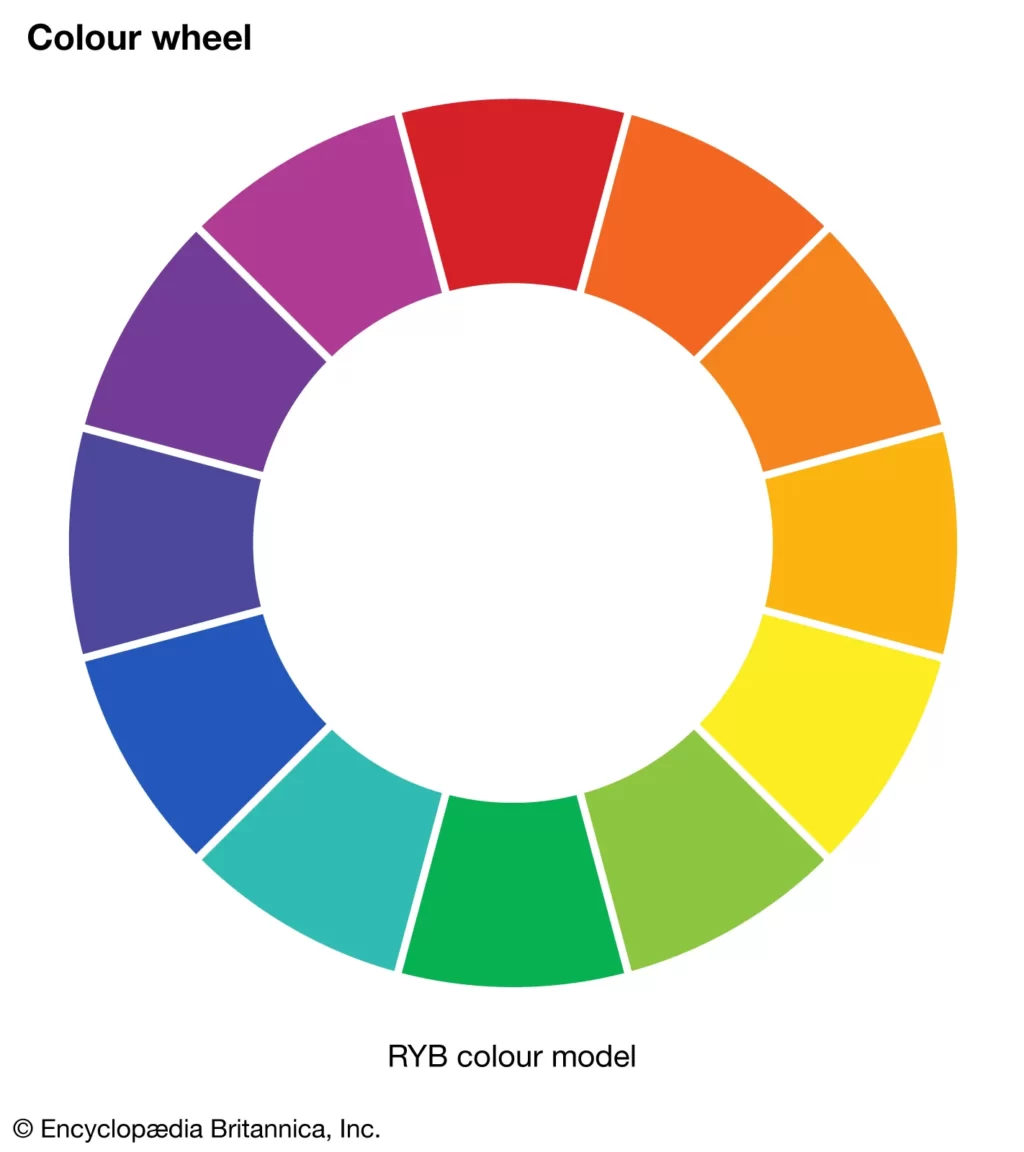
One of the most common concerns when choosing paint colors is determining which shades go well together. A simple tool that can assist in answering the issue is the color wheel. Every decorative color combination can be characterized by its location on the wheel, a diagram that displays the colors of the rainbow divided into 12 main colors. To make this theme easy to understand, it’s further divided into three primary colors, three secondary colors, and six tertiary colors. Once you comprehend the color wheel theory and its hundreds of possibilities, it becomes a useful tool for deciding what color to try at home.
Color Wheel and The Color Theory
Designers and artists use color theory to choose their best color combinations. Color theory is a blend of art and science that assists in the selection of attractive colors. The color wheel was invented by Isaac Newton in 1666 and serves as a foundation for color theory. It shows how colors relate to each other.
Color harmonies are colors that look good together. Artists and designers use them to produce a specific style or emotion. You can use a color wheel and color combination guidelines to identify beautiful color combinations.
The Color wheel is classified into two categories.
- RYB (red, yellow, blue) is a color scheme for artists who mix paint.
- RGB (red, green, blue) is used for online applications such as computers and television screens.
The canvas color wheel is an RGB wheel developed for use on the internet.
Primary, Secondary, and Tertiary colors
The color wheel has 12 main colors that the RGB represents:
- Red,
- Orange
- Yellow
- Chartreuse green
- Green
- Spring green
- Cyan
- Azure
- Blue
- Violet
- Magenta
- Rose
The color wheel has three categories: primary, secondary, and tertiary.
-
Primary Colors:
The primary colors in the RGB wheel are red, green, and blue. When you mix them, you get pure white light. These colors can’t be made by mixing other colors.
-
Secondary Colors:
These are color combinations made by the equal mixing of two primary colors.
The traditional RYB color wheel shows that red and yellow create orange, red and blue make purple, and blue and yellow make green.
In the RGB color wheel, there is another set of secondary colors known as additives: blue and green create cyan, blue and red make magenta, and blue and yellow make green.
-
Tertiary Colors:
Tertiary colors are made by blending a secondary color with a primary color.
The RGB color wheel has six tertiary hues: orange, chartreuse green, spring green, azure, violet, and rose.
Tertiary hues in the RYB color wheel are red-orange, yellow-orange, yellow-green, blue-green, blue-violet, and red-violet.
Color Combinations
-
Complementary
Two hues are situated on the opposing sides of the color wheel. Together, these colors will seem brighter and more prominent, creating a high contrast and high-impact color combination.
-
Monochromatic
Three shades, tones, and tints of a single base color. Provides a mild and conservative color scheme. This flexible color scheme is simple to incorporate into design projects for an attractive look.
-
Analogous
On the color wheel, Three hues that are next to each other. This color combination is flexible, yet it can be too much. Select one dominating hue to balance an analogous color scheme and use the others as accents.
-
Triadic
There are three hues that are equally spaced on the color wheel. This offers a softer, more adaptable, high-contrast color scheme compared to the complementary color combination. Color palettes made using this combination are bold and vibrant.
-
Tetradic
A color wheel with four evenly spaced hues. Tetradic color schemes look great and function best when you use the other colors as accents and let one hue be dominant. It becomes challenging to balance your palette when you add more colors.
Warm And Cool Colors
The color wheel divides into warm and cool colors, which is also called color temperature. Warm colors (red to yellow) generate thoughts of coziness and energy, while cool colors (blue to green and purple) create feelings of isolation and serenity, like water. Color psychology says that balancing warm and cold colors in combinations is common and that these color temperatures can influence emotions.
Shades, Tints, and Tones
Color shades, tints, and tones can be created by adding black, grey, and white to a base hue.
-
Shade
A shade is made by adding black to a base hue, minimizing the color. This produces a deeper, richer color that can be dramatic and dominating.
-
Tint
A tint is formed by mixing white into a base color to lighten it. This can make a hue less intense, which is important when balancing more vibrant color combinations.
-
Tones
A tone is made by blending black and white (or grey) with a base hue. Tones, like tints, are softer variations on the original hue. Tones will not look pastel and can highlight complexities not seen in the base hue.
Saturation, Hue, and Luminance
- Saturation: The intensity or purity of a color is defined by its saturation.
- Hue: A hue can be any color on the color wheel. You may change the saturation and brightness of a hue using a color wheel or a color picker.
- Luminance: The quantity of brightness or light in a color is defined as its luminance.
Wrapping Up
The color wheel helps determine which colors go well together. It categorizes colors as warm or cool, and each color may create a particular set of emotions.
Understanding the fundamentals of color can assist you in picking the ideal color scheme for your living space. As a result, the color wheel is beneficial for customizing the look and feel of your living area.